
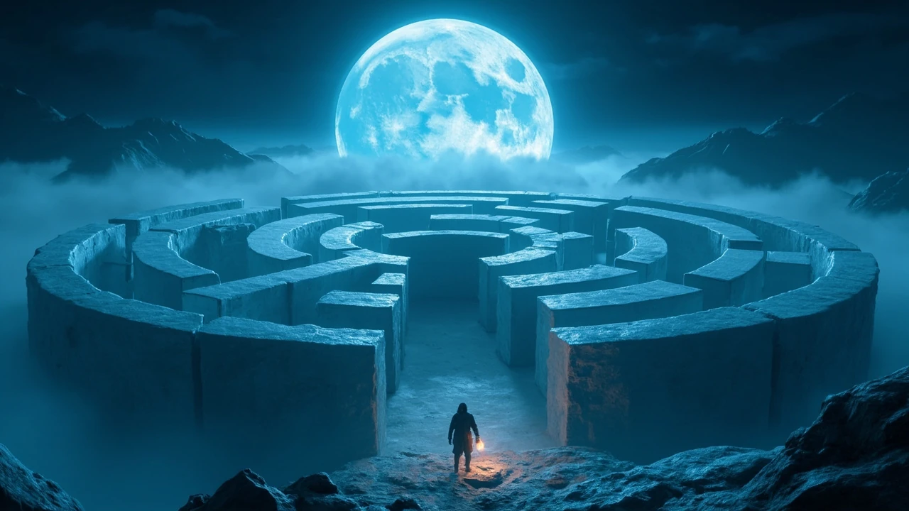
Azure Moon Labyrinth as a game design problem
An azure moon labyrinth sounds like a setting rather than a mechanic, but in practice it is a tightly coupled design problem. The moon provides the light source, the labyrinth provides the constraint, and the color palette provides the emotional register. Get any one of these wrong and the experience collapses into either a generic dungeon crawl or a beautiful but empty walk. This article treats an azure moon labyrinth as a concrete design exercise: what the player feels, what the level must contain, and what the development team has to commit to before the first blockout is built.
Because the phrase is short and ambiguous, the rest of this piece focuses on a single, defensible reading: a hand-built maze environment set at night under a single large, cool-blue moon, with the moon itself treated as both a visual anchor and a gameplay lever. Player guidance, level pacing, art direction, and technical constraints all flow from those three decisions. The notes below are written for a small team that needs to take the concept from mood board to playable blockout without overcommitting to a genre.
For a working frame, designers should read “azure moon labyrinth” as a contract. “Azure” fixes the color and light temperature. “Moon” fixes the time of day, the dominant light source, and the silhouette language. “Labyrinth” fixes the topology: a connected, often non-branching or single-loop network of corridors that the player can learn as a mental map. Treat each word as a constraint and most of the design questions answer themselves.
Reading the brief: what the three words commit you to
Before opening the level editor, it helps to write down what each part of the phrase forbids as well as what it suggests. A useful exercise is to list the genres, art styles, and mechanics that are no longer available, because the same phrase is often pitched with contradictory references attached.
- Azure locks the palette to a cool blue range, typically between a deep navy and a pale ice blue. Warm accents become meaningful only by contrast, so any orange or amber light should be deliberate and rare.
- Moon commits the scene to a single dominant directional light with relatively soft shadows. It also implies a skybox or open ceiling, which changes how you handle occlusion, audio propagation, and enemy line of sight.
- Labyrinth rejects the open-world sandbox in favor of a closed, learnable topology. Navigation becomes a knowledge problem instead of a traversal problem, and the player’s reward is mastery, not exploration of the unknown.
Once those constraints are written down, the team can talk about trade-offs in concrete terms. A biome swap, a weather system, or a day/night cycle can each be evaluated against the brief rather than against personal taste. The brief also helps non-design contributors. A programmer asked to add a dynamic moon position immediately knows the answer should drive shadow length and ambient light, not a calendar of real-world moon phases.
Reference research: what an existing use of the phrase looks like
The phrase “azure moon” has independent cultural uses that can mislead a concept pitch. One documented example is the Japanese single “Azure Moon” by Every Little Thing, released as a ballad with an accompanying acoustic live event. That use of the phrase is a poetic image rather than a setting, but it confirms that “azure moon” reads as a melancholy, contemplative image in popular culture. Designers borrowing the phrase should expect players to arrive with that emotional expectation, and should treat it as a soft constraint on tone.
The Wikipedia entry is also a useful reminder that evocative names travel across media. A music single, a novel chapter, a game zone, and a mod folder can all use the same two words and mean very different things. The safest move is to keep the core design contract documented in a one-page brief that everyone can refer back to, rather than relying on a mood board alone.
Defining the player experience in one sentence
Every successful maze game has a one-sentence answer to the question, “What does it feel like to be lost here?” For an azure moon labyrinth, a workable first draft is:
The player feels like the only person awake in a quiet, pale world, slowly learning the shape of a place that was built to be remembered.
That sentence does three things at once. It fixes the emotional register to quiet and contemplative. It commits the player to a single, distinct body, which clarifies AI, camera, and audio decisions. It frames the labyrinth as a learnable space, which rules out procedural or randomized layouts in favor of a hand-authored topology.
Once the sentence is in place, the team can audit every feature against it. A boss fight with loud combat audio contradicts the sentence. A randomized corridor layout contradicts it. A single puzzle that requires the player to backtrack through previously learned sections reinforces it, because the satisfaction comes from knowledge, not from reflexes.
Labyrinth topology: choose one shape and commit
The word “labyrinth” is often used loosely, but it has a real design lineage. The two historical forms are the unicursal maze, which has a single winding path with no branches, and the multicursal maze, which has many branches and dead ends. Modern games usually pick a third option: a small, hand-authored graph of rooms and corridors that feels maze-like without being statistically a maze at all.
For an azure moon labyrinth, the multicursal option is usually the strongest fit, but only if the team can afford the cost of teaching the player the map. A unicursal layout is easier to author and to test, and it pairs well with a contemplative tone because the player is always moving forward. The graph-of-rooms option is the most flexible, and it is the only one that supports shortcuts, keys, and unlockable loops without scripted events.
| Topology | Player mental model | Authoring cost | Fit for an azure moon labyrinth |
|---|---|---|---|
| Unicursal single path | “Follow the line.” | Low. One path, no branches. | Strong for short, atmospheric experiences. |
| Multicursal true maze | “Remember the turns.” | High. Many dead ends to test. | Strong when the maze itself is the puzzle. |
| Hand-authored room graph | “Learn the map as a network.” | Medium. Modular rooms and connectors. | Strong when progression keys and shortcuts are needed. |
| Procedural maze | “No map, every run is new.” | Low authoring, high validation. | Weak unless the brief is changed to support replay. |
Whichever option is chosen, the topology should be locked in early. Changing the topology late in production is one of the most expensive changes a small team can make, because it invalidates pacing, audio cues, save data, and playtest notes. The rest of this page assumes a hand-authored room graph, because it is the most common modern fit for a single-session contemplative experience.
Lighting the labyrinth with a single cool key light
A moonlit environment is deceptively hard to light well, because the eye expects a real moon to behave like a real moon. Shadows should be long, ambient light should be cool but not pitch black, and surfaces should pick up a soft directional gradient. A common mistake is to use a neutral ambient term and a single cool key, which produces a flat, illustrative look that the player reads as artificial.
A useful starting point is a three-term setup: a cool key light at low intensity to represent moonlight, a slightly warmer low-intensity fill to keep skin and cloth readable, and a faint blue ambient term tied to the skybox. The skybox itself should not be pure black, because a real moonlit sky still has a gradient near the horizon. The eye notices a black skybox long before it notices a missing star field.
| Light term | Color temperature | Approximate intensity | Role in the scene |
|---|---|---|---|
| Key (moon) | Cool blue, roughly 8000K | Low, dominant shadow caster | Defines the silhouette and the direction of shadows. |
| Fill | Neutral to slightly warm | Medium, broad source | Keeps materials and faces readable without flattening. |
| Ambient | Cool blue, sky-tied | Very low, global | Lifts deep shadows and prevents black crush. |
| Accent (lantern, rune) | Warm or saturated color | Localized, high contrast | Provides visual landmarks and emotional punctuation. |
Accent lights matter more than they look. A maze that is lit only by the moon will read as monochrome, and the player will struggle to remember which corridor is which. A small number of warm accent lights, placed at landmarks the player needs to recognize, gives the map a second color channel without breaking the brief. The same principle applies to sound, where a single recurring motif at each landmark is more useful than a uniform ambient track.
Teaching the player the map without a HUD
For additional context, Maze games fall into two camps: those that hand the player a map, and those that make the map itself a resource. An azure moon labyrinth is a strong fit for the second camp, because the central pleasure is learning the shape of the place. A map icon that fills in as the player walks through corridors turns exploration into a visible reward, and it gives the player a reason to revisit areas that initially felt empty.
A practical approach is to combine three layers of guidance. The first is environmental: landmarks, accent lights, and recurring motifs that the player can use to anchor their internal map. The second is audio: a soft directional cue that changes when the player is heading toward the center of the maze, and a different cue when they are heading back to the entrance. The third is a minimal in-world map, drawn in the player’s journal or projected onto a stone surface, that fills in as corridors are explored.
- Place a unique landmark at every junction that opens into a new region, not just at the end of a corridor.
- Use one consistent material for “safe” corridors and a different material for corridors that lead to dead ends, so the player can read the geometry before walking it.
- Tie audio cues to the player’s orientation relative to the maze center rather than to camera-relative directions, because the camera is more likely to mislead than the compass.
- Reveal map segments only after the player has reached a landmark, so the map represents knowledge, not proximity.
The cost of these choices is real. Every landmark needs to be readable from a distance, which means silhouette and color carry more weight than detail. Every audio cue needs to be tested with headphones, speakers, and reduced hearing, because a cue that is obvious to a designer is often invisible to a first-time player. The benefit is that the maze teaches itself, which removes the need for a heavy tutorial layer.
Pacing a single-session labyrinth
Most small-team projects make the mistake of pacing a maze like a dungeon, with combat encounters and loot gates every few rooms. That works for power fantasies, but it works against the brief of a contemplative labyrinth. The player’s reward is recognition, not reward drops, so pacing should be measured in revelations rather than in enemy waves.
A workable pacing template is a single-session structure with three phases. The opening phase introduces the maze, the lighting, and the core verb. The middle phase rewards the player for learning the layout by unlocking a shortcut or a new region. The closing phase collapses the maze into a small number of meaningful choices, so the final minutes are decisions rather than navigation.
| Phase | Player goal | Level design moves | Failure mode to avoid |
|---|---|---|---|
| Opening | Learn the rules of the world. | Short loops, visible landmarks, one safe hub. | Overwhelming the player with corridors before the verbs land. |
| Middle | Map the maze and form theories. | Shortcuts, region transitions, audio cues tied to direction. | Padding the middle with empty corridors that the player reads as filler. |
| Closing | Apply the map to a small number of choices. | Collapsed region, key doors, a small set of meaningful paths. | Adding a sudden combat spike that breaks the tone. |
Each phase should be timed in playtest. A common pitfall is that the opening phase runs twice as long as the team expects, because the team already knows the map. Time the phases from a fresh player’s first attempt, and use that timing to drive cut or expand decisions before the level is fully dressed.
Art direction: the cool palette and what it costs
Azure is a small word with a large budget. A pure azure palette will make every surface look the same after ten minutes, which is the fastest way to lose a player’s interest. The fix is to use azure as the dominant color, not the only color, and to introduce variation through material, scale, and accent rather than through hue.
A useful trick is to grade the palette by distance. Foreground surfaces sit closer to true azure and pick up more moonlight detail. Midground surfaces shift toward desaturated blue-gray, which the eye reads as “further away.” Background surfaces can drift toward a pale silver or near-white where the sky meets the maze, which gives the silhouette a clear horizon line. The same trick can be used vertically: high walls pick up moonlight more strongly than low floors, which subtly tells the player where to look.
- Limit warm color to a small set of accent objects, so warm reads as a signal rather than as decoration.
- Use a single recurring material, such as pale stone or dark glass, as the “voice” of the maze, and vary everything else around it.
- Reserve the highest contrast, such as white against deep blue, for the moments the player is meant to remember.
- Avoid pure black. A real moonlit scene never reaches pure black, and a black surface breaks immersion more than a noisy texture does.
The technical art budget should reflect the same logic. A small number of high-quality materials will read better than a large number of average materials, and a single detailed hero asset at the maze center will anchor the player’s map more strongly than a forest of decorative props. The art brief is a constraint, not a wish list, and the team should know in advance which surfaces will be touched by a lighting artist and which will not.
Audio design for a quiet, moonlit space
An azure moon labyrinth is a quiet space by definition. Loud combat audio, busy music, and constant ambient chatter will fight the brief, and the player’s ear will eventually tune them out, which is the worst possible outcome for an audio-led design. A better starting point is a single ambient bed, a small set of musical motifs tied to landmarks, and a careful use of silence near the maze center.
Silence is a real tool, but it is expensive. A pause in ambient audio that lasts more than a few seconds will read as a bug to most players, so any silence needs to be motivated by a gameplay event, such as a key pickup or a new region transition. The same is true of loud events: a single loud musical sting at the maze center is more powerful than a continuous soundtrack, because the player has been listening to quiet for the entire session.
| Audio layer | Role | When it should be present | Failure mode |
|---|---|---|---|
| Ambient bed | Establishes place and time of day. | Throughout, ducked under other layers. | Becoming so uniform the player stops hearing it. |
| Landmark motif | Acts as an audio landmark for the player’s map. | At each distinct region or landmark. | Reusing the same motif for two different landmarks. |
| Player feedback | Confirms actions and puzzle states. | Triggered by verbs, never by camera. | Playing feedback that overrides the ambient bed and breaks immersion. |
| Silence as punctuation | Marks a meaningful moment in the player’s run. | Bounded, motivated by an event. | Silence that reads as a missing audio file. |
Audio mixing should be tested on a single pair of stereo speakers, a single pair of headphones, and at least one device with small built-in speakers, because moonlit scenes tend to push the mix toward low frequencies, which small speakers reproduce poorly. If the mix collapses on small speakers, the team has to choose between raising the bed, which dilutes the quiet, or reducing the low end, which can thin out the room tone. There is no clean answer, and the choice should be a deliberate aesthetic decision rather than a default.
Technical constraints for a small team
A hand-built moonlit maze is not a heavy technical project by default, but the choices a small team makes about lighting, geometry, and streaming can quietly multiply the cost. The biggest risk is over-investing in real-time lighting, because dynamic shadows across an open maze with high walls are expensive on most platforms, and the visual gain is small compared with baked lighting plus a single dynamic moon position.
A common technical split is to bake the ambient and indirect lighting, use a single dynamic directional light to represent the moon, and reserve real-time lighting for accent objects that need to react to the player. This split gives the team a stable lighting budget and leaves the door open for a day/night cycle or a moving moon without a full lighting rebuild.
- Bake static lighting into lightmaps whenever geometry is final, and keep one or two dynamic lights for the moon and accent objects.
- Use light probes, not lightmaps, for moving characters, so the player’s body reads correctly under moonlight without per-frame shadow rendering.
- Stream the maze by region, not by corridor, so the player does not see geometry pop in as they turn corners.
- Test the build on the lowest target hardware early, because a maze that struggles to maintain frame rate will undermine the quiet tone more than any art choice can rescue it.
The same logic applies to memory. A maze that has been hand-authored is usually a memory-positive project, because the level is bounded and the asset list is finite, but the team should still set a per-region memory budget and a total scene budget before the art pass begins. Discovering that a region is over budget during the lighting pass is a much more expensive conversation than discovering it during blockout.
Validation: how to test whether the maze works
Maze games are unusually easy to break with bad playtesting, because designers know the map and players do not. A useful approach is to run three passes: a fresh-player pass with no assistance, a guided pass where the designer points out landmarks, and a return pass the next day, where the player is asked to reach a specific location without help. The return pass is the most informative, because it measures the player’s mental model rather than their immediate experience.
What the team learns from these passes is more useful than any metric. If fresh players get lost in the first ten minutes, the opening phase is too long. If return players cannot reach a target without help, the landmarks are not doing their job. If guided players describe the same experience as fresh players, the audio cues are not adding information. None of these signals require a survey form to capture, and all of them are easy to miss if the team only watches streamers play.
| Playtest pass | What it measures | What failure looks like | What to do next |
|---|---|---|---|
| Fresh player, no assistance | First impression and onboarding. | Player stuck in the first loop for more than five minutes. | Simplify the opening phase and add an early landmark. |
| Guided walkthrough | How the designer expects the maze to be read. | Designer must explain landmarks the player did not notice. | Rework the silhouette or color of those landmarks. |
| Return visit, target reach | Strength of the player’s mental map. | Player takes significantly longer than the designer’s own route. | Add a second audio cue or a map reveal tied to the missed area. |
| Replay, fresh save | Whether the maze is learnable or only solvable. | Player cannot repeat the run without help. | Consider whether the design is too dependent on accident or randomness. |
Validation should also include accessibility checks. A moonlit scene is one of the harder environments to make readable for low-vision players, because the contrast between cool blue surfaces and deep shadow is often small. The team should test with high-contrast modes, subtitle and audio cue systems, and reduced-motion settings before the project ships, not as a post-launch patch. None of these checks require a separate design pass, and most of them surface issues that improve the experience for every player, not only for those who need the accessibility options.
Frequently asked questions
What genre fits an azure moon labyrinth best?
The phrase fits a contemplative, single-player experience best. Walking simulators, light puzzle games, and short adventure games are the closest matches, because the central verb is exploration and the central reward is the player’s own mental map. Action-heavy genres can be made to work, but only if the team is willing to soften the brief to allow combat audio and frequent interruptions.
How long should an azure moon labyrinth take to play?
For a small team, a single-session experience in the 30 to 90 minute range is the most defensible target. Anything shorter starts to feel like a demo, and anything longer requires a strong second verb to keep the player engaged past the first hour. The pacing template here assumes that range, and the team’s first playtest should confirm whether the target length matches the content they actually have.
Do I need a dynamic moon, or can I bake the sky?
A baked skybox is usually enough for a single-session experience, and it is dramatically cheaper to maintain. A dynamic moon position is worth the cost only if the design depends on shadow length changing during play, which is rare in a contemplative maze. If the design does depend on it, the team should plan for a single scripted moon event rather than a free-running day/night cycle.
How do I keep an azure palette from feeling flat?
Treat azure as the dominant color, not the only color, and reserve warm accents for landmarks. Use material variation, scale, and lighting gradient to create depth, and let one or two surfaces per region carry a slightly different hue. The goal is to give the player’s eye something to land on, not to fill the scene with new colors.
Should the labyrinth have combat?
Combat is allowed, but it should be motivated by the brief. A single combat encounter near the maze center, timed to a narrative beat, can work. A repeating combat pattern through every corridor will break the tone and make the player resent the maze. If the team’s heart is set on combat, the design is probably a dungeon rather than a labyrinth, and the brief should be rewritten to match.
Can the maze be procedural instead of hand-built?
Procedural generation is possible, but it works against the central pleasure of the design, which is the player’s ability to learn the map. A procedural labyrinth can be made to feel maze-like, but it cannot give the player the satisfaction of recognizing a turning they have seen before. If the team chooses procedural generation, the design needs a different reward structure, and the brief should reflect that.
What is the single biggest risk for a project like this?
The biggest risk is over-scoping the second hour. A team that nails the opening 30 minutes will be tempted to add mechanics, regions, and story beats to fill a longer experience, and almost every one of those additions will dilute the brief. The safer move is to ship a short, polished experience and treat any expansion as a separate project with a brief of its own.
How do I know the player is actually learning the map?
The clearest signal is the return-play pass. If a player who has completed the maze once can reach a specific target on the second run without help, the map is doing its job. If the player hesitates, backtracks, or asks for a map, the landmarks are not strong enough, and the team should rework the silhouette and color of the missed areas before adding more content.
